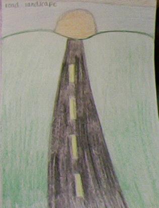
This is a picture of a road leading to a sunset.
|
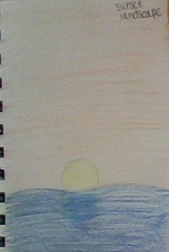
This is a picture of a sunset over a lake.
|
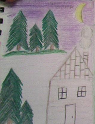
This is a picture of a cabin out in the woods with some trees.
|
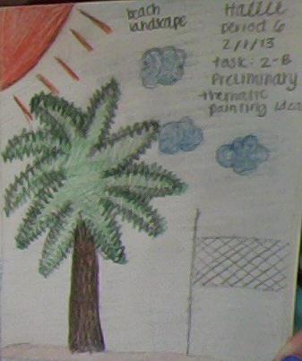
This is a picture of a beach scene with a palm tree.
|

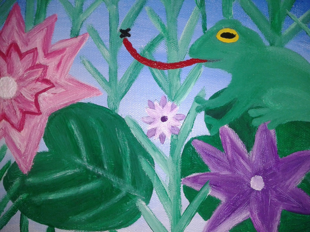
This is a picture of my ladnscape. It shows an upclose of the frog, lily pads, and flowers.
|
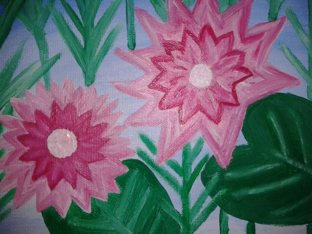
This is a close up of my flowers. It shows the tinting I added to them.
|
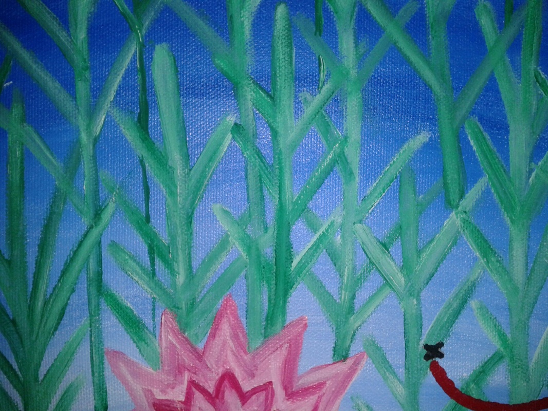
This is a close up of the grasses that are in the water.
|
This is an over all picture of my painting.It's a landscape of a pond.
|
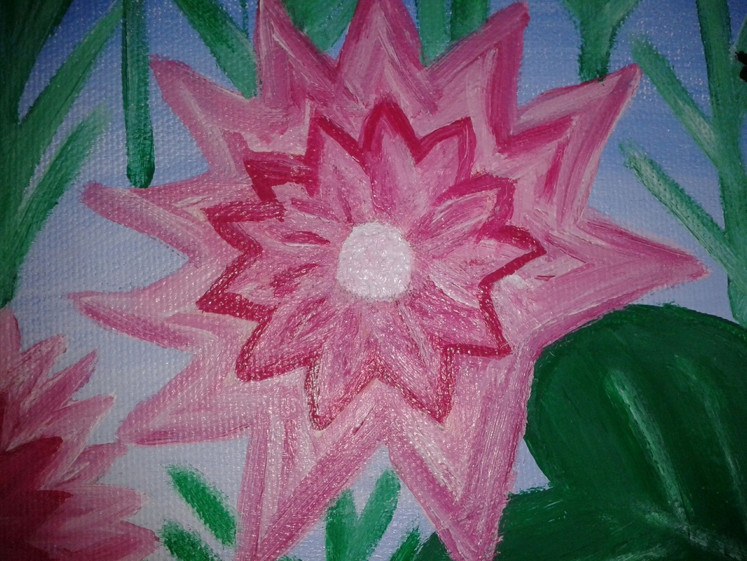
This is a close up of one flower. It shows the details I added to the pedals.
|
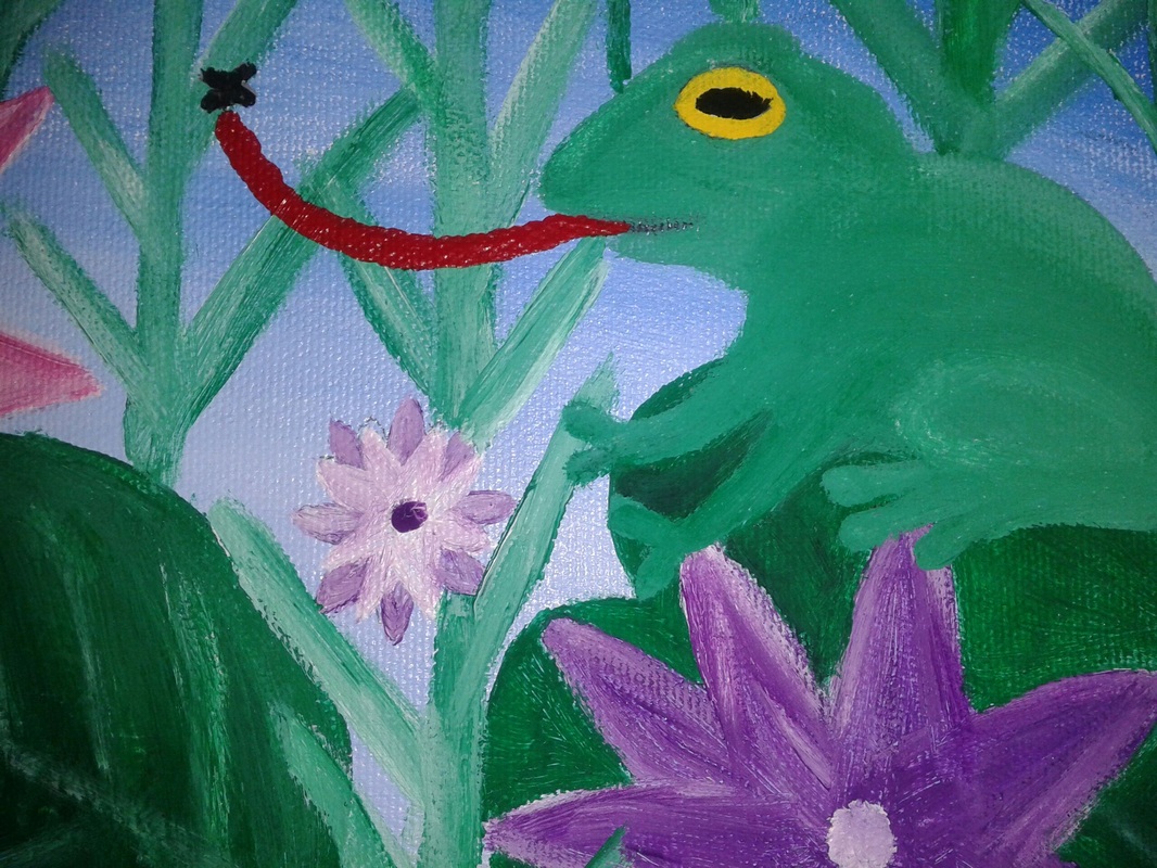
This is another close up of my frog, it shows the detail and tints I added.
|
1) The strong parts of my project would be the blending and adding different values by adding white because it made things look some what real.
2) I think I could of thought of different ideas for the back ground instead of just having grass because it would of had more details.
3) The theme of my painting is nature because of the pond like look with the flowers and frog. I did this design because I like nature and I like flowers and froggies.
4) The major colors of my project are green, violet, and pink. There are a lot of tints of green, they helped create the theme because ponds are green and full of lily pads and grasses.
5) The light areas are the bottom of the pond because it starts with dark blue and fades into white. Other areas are all over because all of my objects have white tints in them. The dark value would be the top of the sky because I added black to the blue to make it darker.
6) What I learned was that adding tints and shades to objects make them look more life like. I also learned that if you mess up you can just paint over it.
7) First I painted the background, then I started painting the flowers, next I decided that I should add grass and lily pads to the background, I later decided to add a frog and add more grass to the background for more detail. I had no idea what it was going to look like, I just added more random things as I went.
8) I liked this project because we got to build it, paint what we wanted, and got to be creative with it. There wasn't anything that I didn't like about the project.
